

This thread has been viewed 5968 times.
Oh fuck no, that looks awful
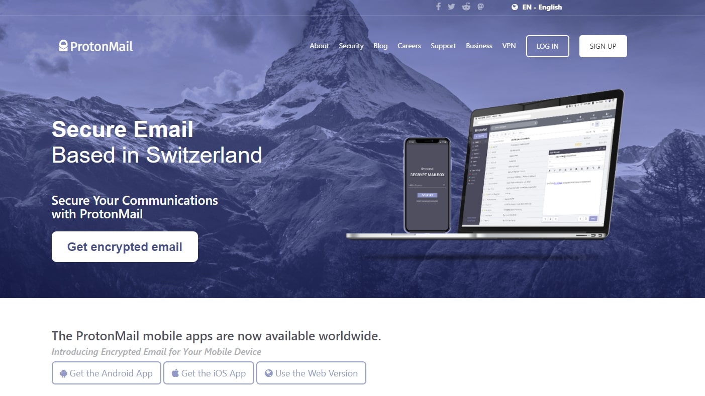
That looks like some social issue campaign and event from some university.Oh fuck no, that looks awful
A logo apt for Breast Cancer Awareness DayThat looks like some social issue campaign and event from some university.
i hate globohomo so much it deserves its own hate threadsoulless corporate, globalist, propaganda line art trend
Update: They changed it to red and still looks like some antibullying campaignA logo apt for Breast Cancer Awareness Day
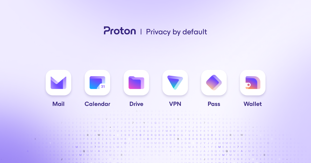
This one actually isn't that bad. I can understand why they would want to make the logo look less 70's. It stands out quite a bit more than the original with the pink and black, though I still prefer the original. It would be better if they stylized the text a bit somehow. Especially the bottom text that looks like it's just times new roman.
Fair enough, at least I can come to a place like this every once in a while to remember that we used to actually have a golden vision of the futureBest thing is to stop getting emotionally invested in million/billion dollar corporations and whatever their marketing sissies shit out.
i hate globohomo so much it deserves its own hate thread
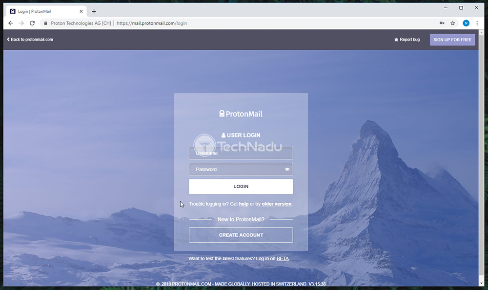
Thought I was the only one. Buddy has an android, homepage looked borderline unusable to me.
I try my best not to have favourite brands. I don't let corporations control my feelings. Logo changes don't affect me emotionally.Anyone else get a little uncomfortable when they see their favorite brands become over simplified?
Minimalism went over the deep end years ago, and at this point it is simply obnoxious how awful it is now. I went in to a Taco Bell a few weeks ago and I thought I was at a fucking dentists office. Everything has turned in to flat, untextured polygons to the point where if I go to the city it looks like these buildings haven't finished loading yet or something. Only minimalism I really believe in is webpages. Internet is bloated and if your website is over 2mb you're doing it wrong. Plain HTML or bust. And don't even get me started on this fucking abysmal, soulless corporate, globalist, propaganda line art trend companies are using now. That deserves its own thread tbh.
View attachment 19308

LMFAO I was actually looking for this to post in here but I couldn't find it. I had seen it before thank you for reading my brain.


 proton.me