How do you make the two columns always extend to the bottom of the viewport, regardless of how much content they contain and without creating scrollbars?
I have been trying to make this layout work all day and haven't accomplished anything other than giving myself a headache.
If you're talking about with just a plain multi column:
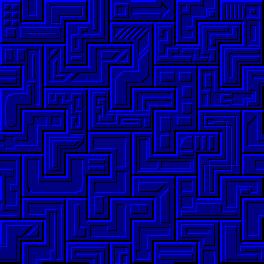
you technically can't, because your container div for the floats won't actually have a height unless you set a fixed height. You can see how it's not happening in a shitty example I built out a few days ago:
This is a three column, but same principle:
CSS:
#body {

background:#ff0000;

}


#container {

border-style:solid;
border-color:#000000
}


#container:after{ /*this sets up the float "clear" that's needed to keep the container div from "collapsing"*/

content: "";

display: table;

clear: both;

}
(the actual CSS and HTML are pretty different from this, but hopefully it gets across what's going on).
if I were to change the bg color of the container to match the side columns, I could make it *look like* they go on for 100%, but the container doesn't actually have a height to peg a percent-based height to for the floated columns because of some shenanigans that happen when you do a classic float setup like this.
That would be effectively how you make it *look like* you have sidebars that go on for 100%.
https://riseup.net/ kinda has an example of this. Their page is much more complex than my example, but in a nutshell, the big content div in the middle is a container holding a 2 column setup (the main content and the "system updates" to the right). As you can see, the main content is shorter than the system updates, but they make it look like it goes on to the end by making the container div have the same bg color as the 2 columns it contains.
EDIT: Floats are an old way to do this, and how I always knew how to do it. CSS has improved since I really did this stuff seriously lol.
If you want multiple columns of the same width, you do a flexbox with modern CSS. To do that, you make a container div, and then put other divs inside of it.
You'd style the container div with display: flex;
CSS:
<style>

.container{

display:flex;
height:100%;

}

.container > div {

[whatever]

}

#individual_divs{

[set particulars like width and such]

}
</style>

<div class="container">

<div>Content and such</div>
<div>More content</div>
<div>even more</div>

</div>
This would make 3 divs in a row that are next to each other.
Redoing my shitty example above like this, we get something better:
Now then, for taking the scroll bars off of the iframes (I know I mentioned iframes in the post you're quoting, so I'm assuming that's what you're talking about having scrollbars, since divs need overflow: scroll to be set manually), note that I haven't worked with iframes in over a decade, but just looking around it looks like there's a couple ways you could try this:
- set overflow: hidden for the <html> element of the document that's to be rendered in the iframe (note: *not* the page the iframe is on!)
- use the <iframe> tag's scrolling="no" attribute (deprecated and may not work)
- do both and hope it works lol


 Nightmare stops
 Hello Kitty Ad
 Zoomer Tide
 Dear world
 ORA!
ORA!
 Messager SHY girl
 Junko
Junko
 Run for your life